AXA US landing page & navigation redesign - case study
AXA is a global insurance company with customers in 50 countries around the world whose individual and group life insurance policies include savings and retirement products, as well as health and personal protection. One of the projects I got to work on was a redesign of a landing page and the main navigation of the US branch website.
Discovery phase
Problem
The conversion rate was low for new users. The bounce rate was high for clients trying to file a claim. The requirement was to make minimal changes to the existing website.
User research/competition analysis
For user research I, along with one of my colleagues, conducted seven interviews with new prospects and five interviews with existing clients. I also studied GA metrics to identify high bounce areas and did some market research to analyze competitors' usability, and opportunities for differentiation.
Something that stood out to me was when one of interviewees mentioned that they just had a baby and were looking to get an insurance but couldn't decide what plan would work best for them. Other concerns were that people never heard about AXA before and were hesitant to trust the company with their finances. It also became evident that we needed to focus on providing clear entry points for different user groups on the landing page and in the main navigation.
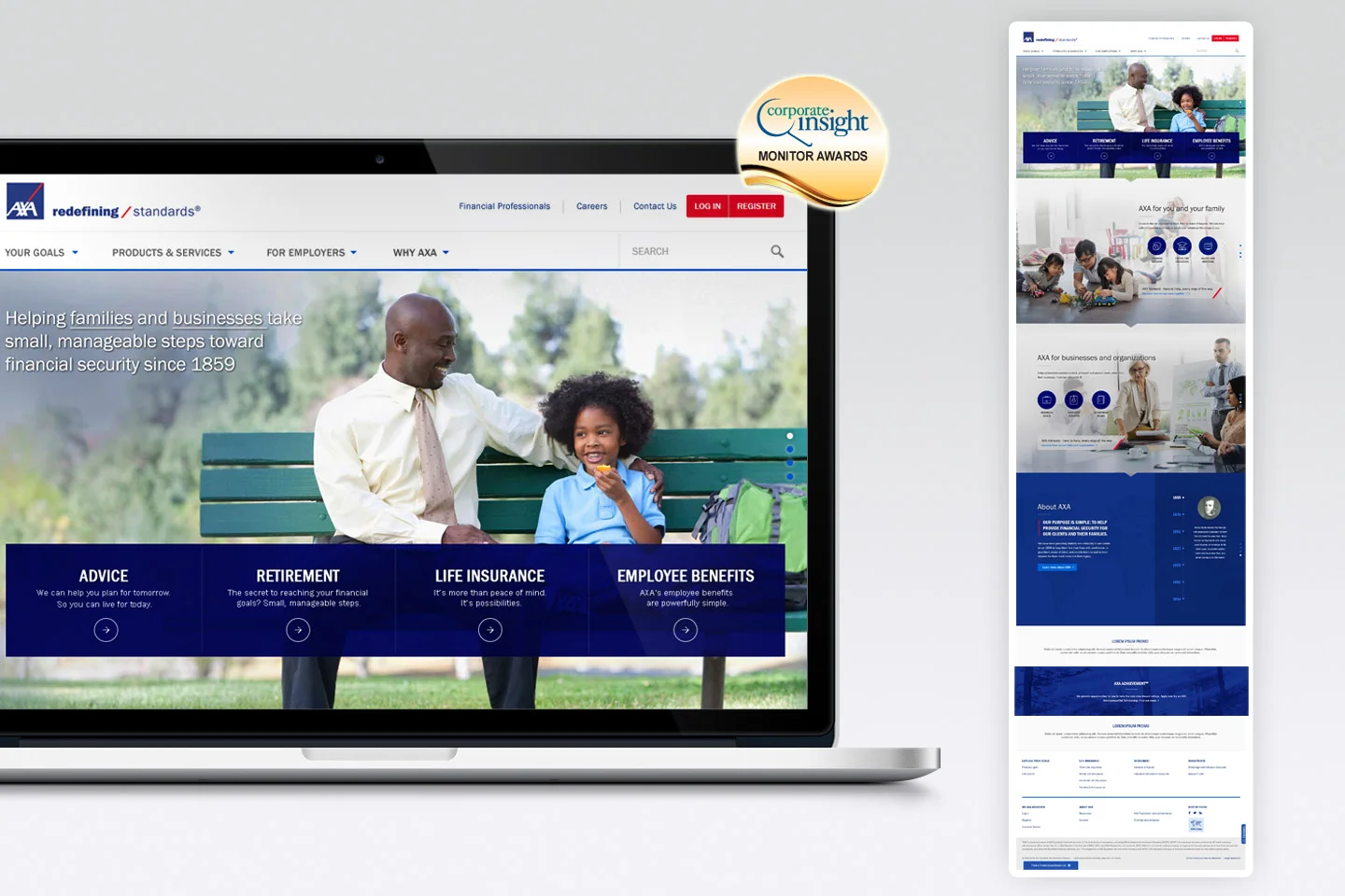
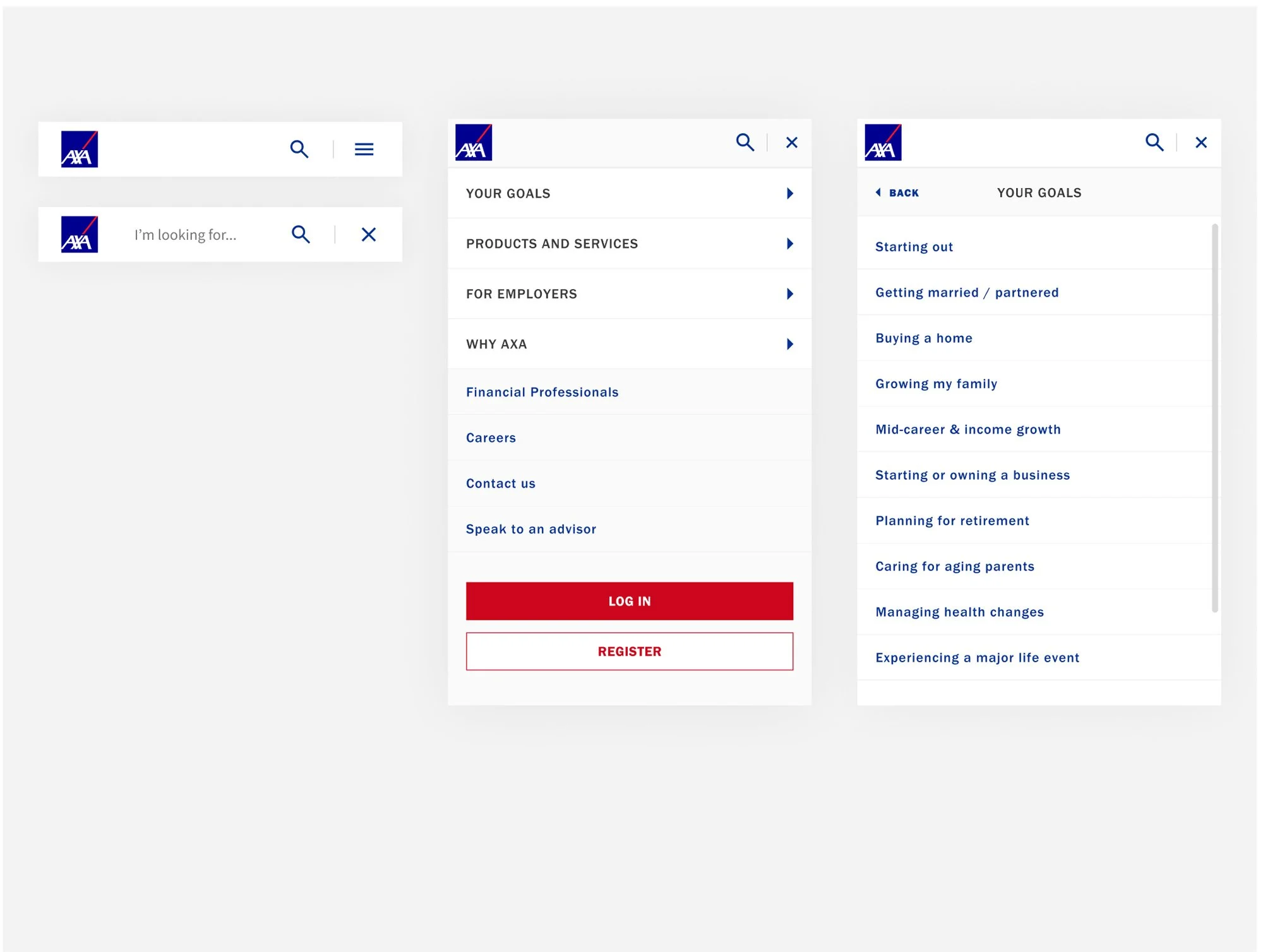
Three main changes were proposed: organizing content in the main navigation around user intent rather than company structure, increasing trust with prospective clients by adding information about company and its history to the home page, and adding steps and tracking to reduce bounce rate in the filing a claim flow.
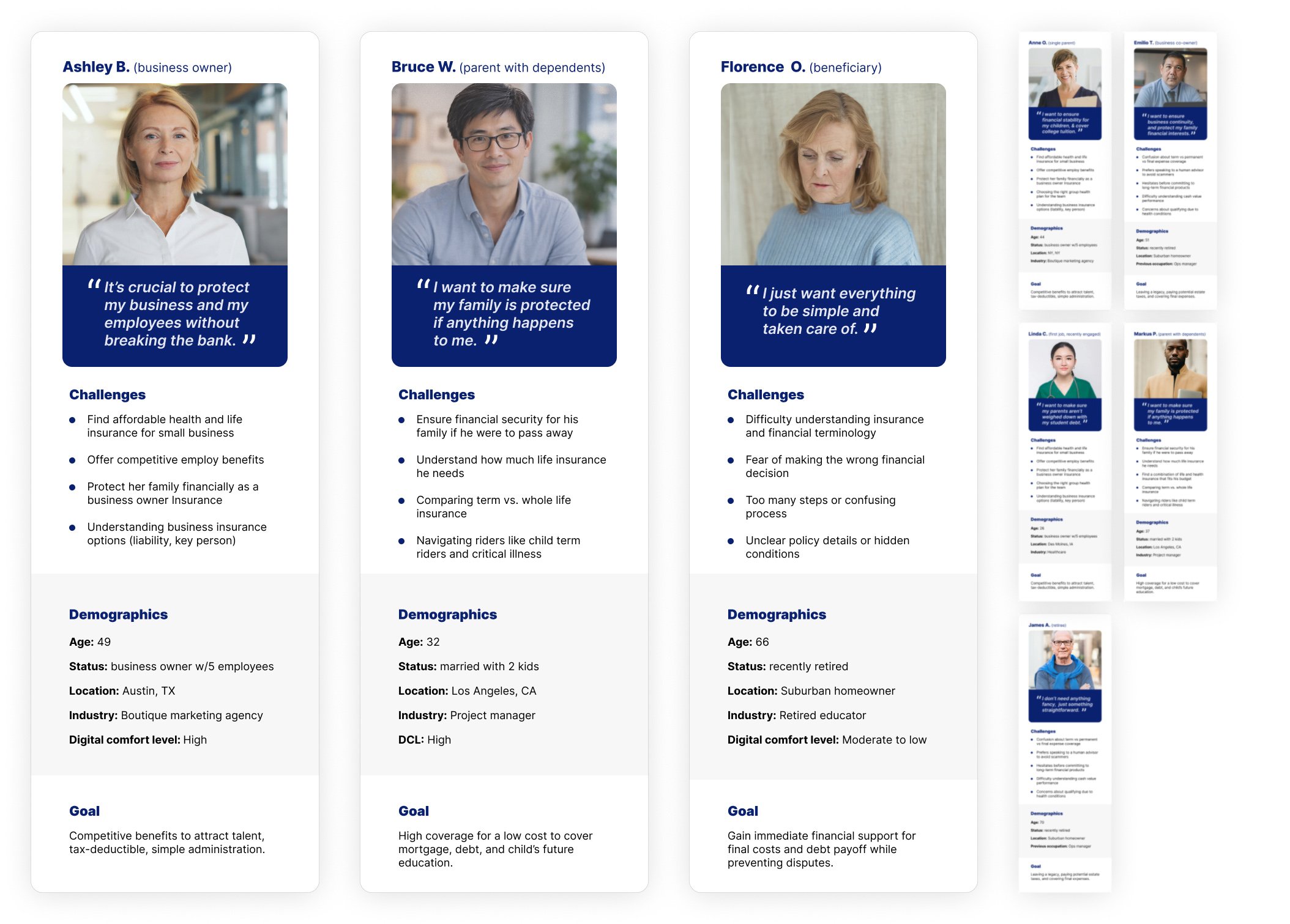
User profiles
With input from the stakeholders, six existing personas were updated and two new personas generated to help guide decisions about product features and navigation. We decided to focus on three of them, choosing those that represented major user groups experiencing issues outlined above.
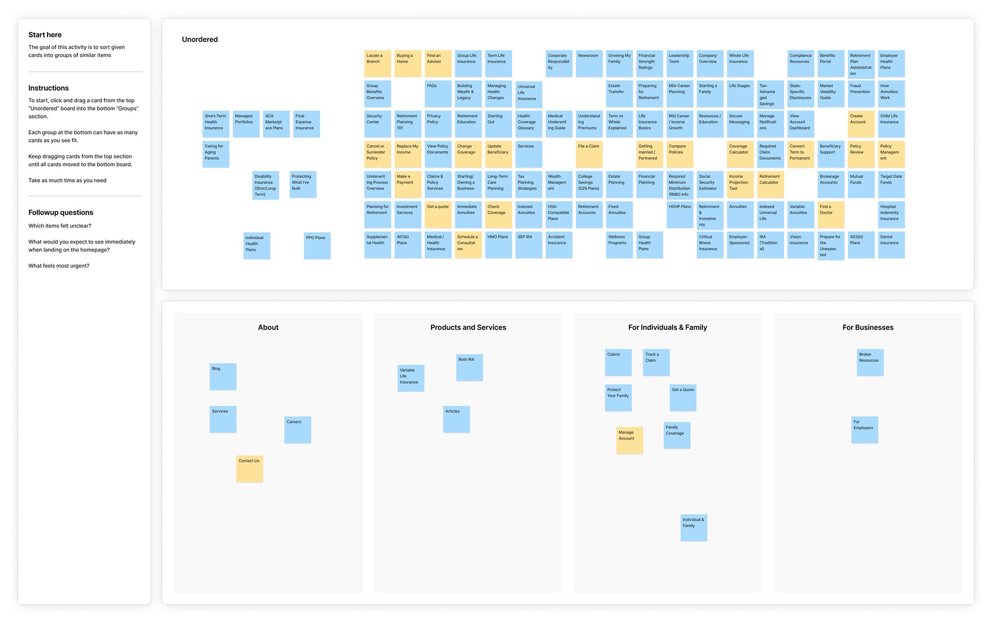
Card sorting
To helps identify logical groupings in the main navigation and to improve information architecture, we used a closed card sorting method where participants sorted content into predetermined categories.
Journey mapping
Taking the time to map out how users interacted with the existing website provided a clear list of touchpoints and revealed new opportunities we hadn’t previously considered. It was helpful in visualizing the narrative and in creatin a shared understanding with multiple stakeholders.
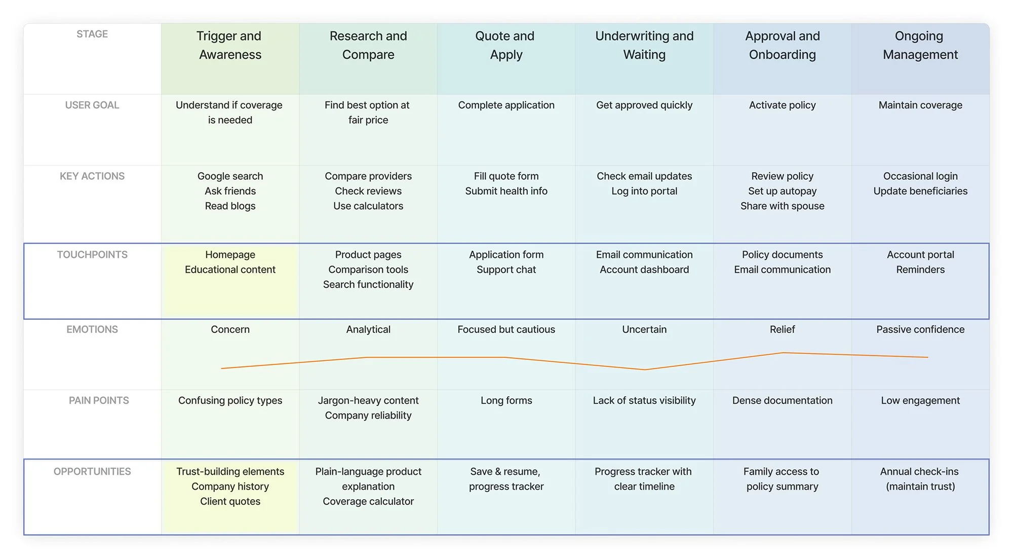
Journey map for persona named Bruce
Development phase
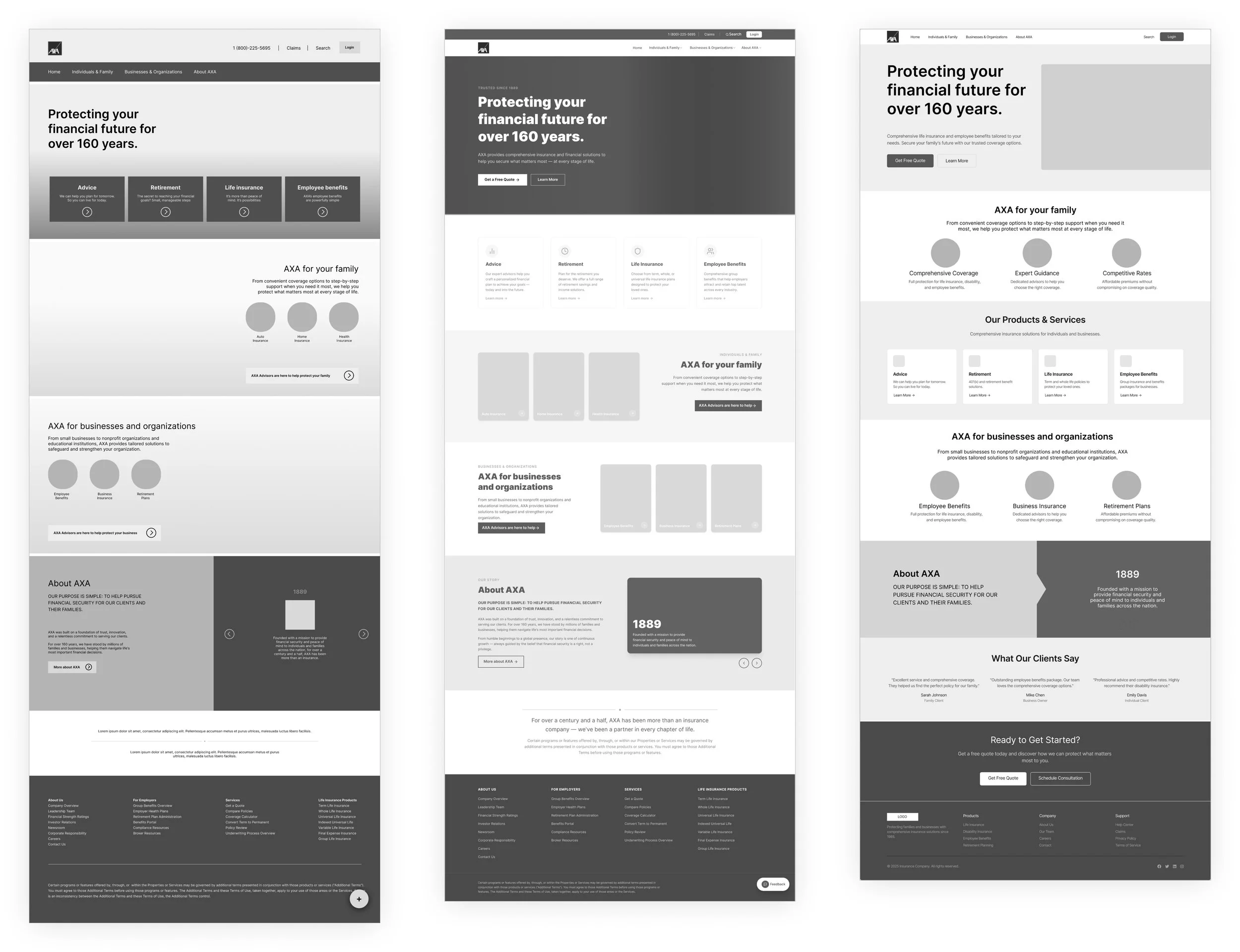
Low-fidelity wireframes & testing
I started my design process by creating wireframes of the main page to establish the layout that aligned with the key personas and addressed the primary issues uncovered during the research phase.
It was clear from the card sorting exercise that the navigation should be tailored to the life stages of a person and that the landing page needed to include a section illustrating the company history to establish trust.

We tested prototypes with users and had them complete multiple tasks, including exploring coverage, filing a claim, finding the right group plan, and locating specific company information. What's measured at this stage was: the first click accuracy - to understand how intuitive the information architecture was, success rate - to see where improvements were still needed, time to completion - to identify bottlenecks in the flow. From observing their behavior during these tasks, the key findings were:
Employer vs Individual segmentation needed multiple entry points on the landing page
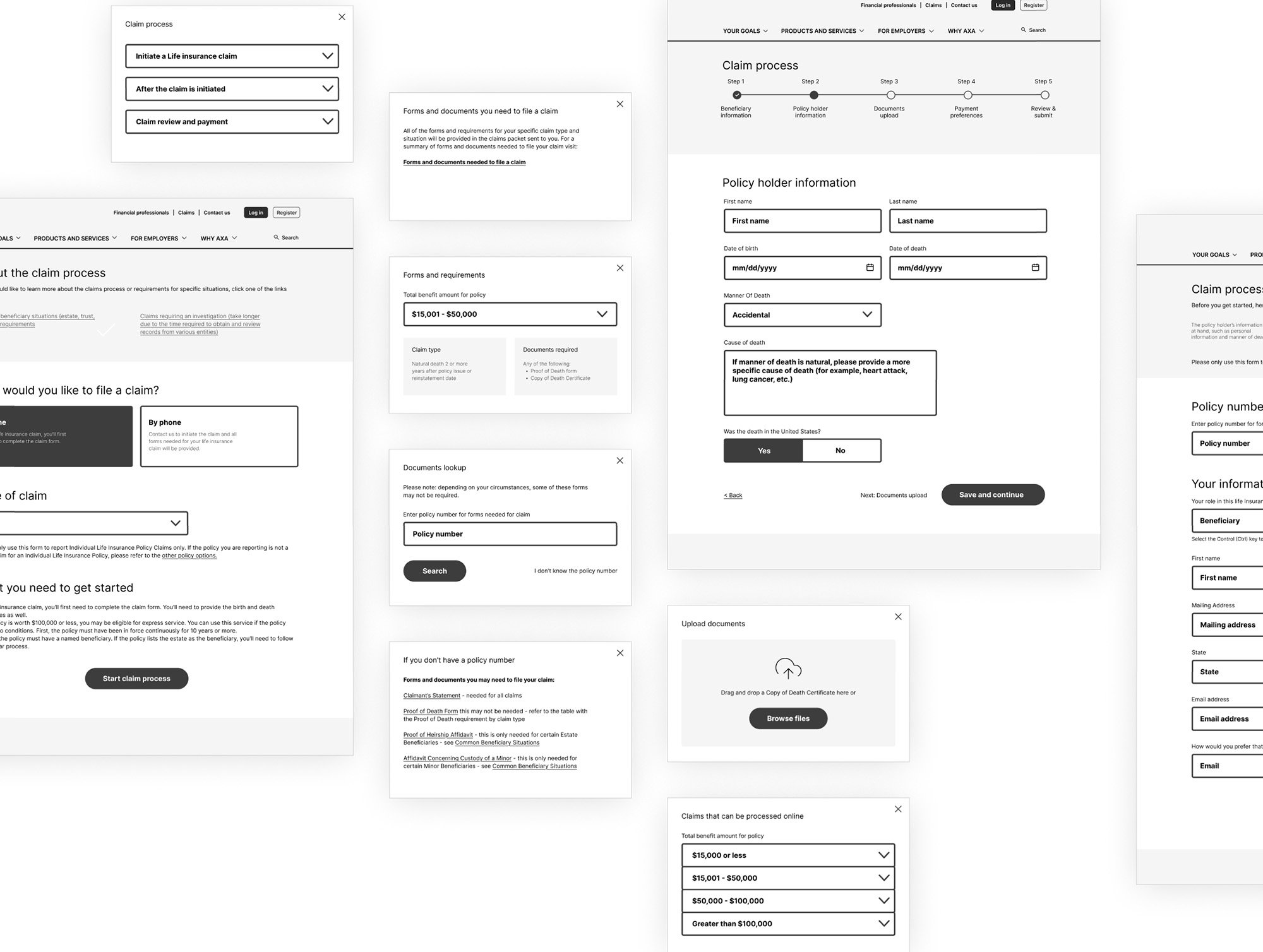
A path to file claims still had a high bounce rate at certain steps………….
Key trust-building information was easily located
To address these issues in the final design the navigation was restructured to focus more on life stages of the main personas, plus additional entry points were placed within the content of the landing page. Submitting claims link was permanently placed in the header outside of the main navigation. List of steps and necessary documents was added to the beginning of each flow. Status tracking added to provide a clear, real-time update on the claim's status.
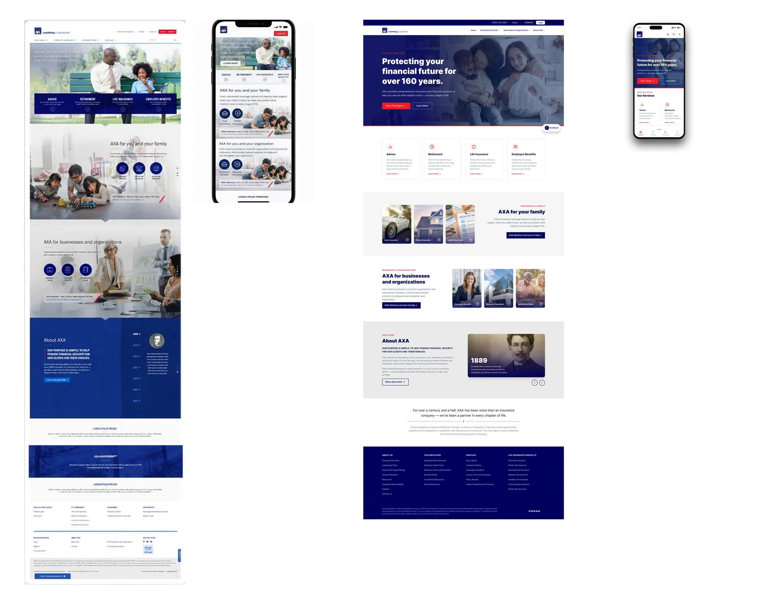
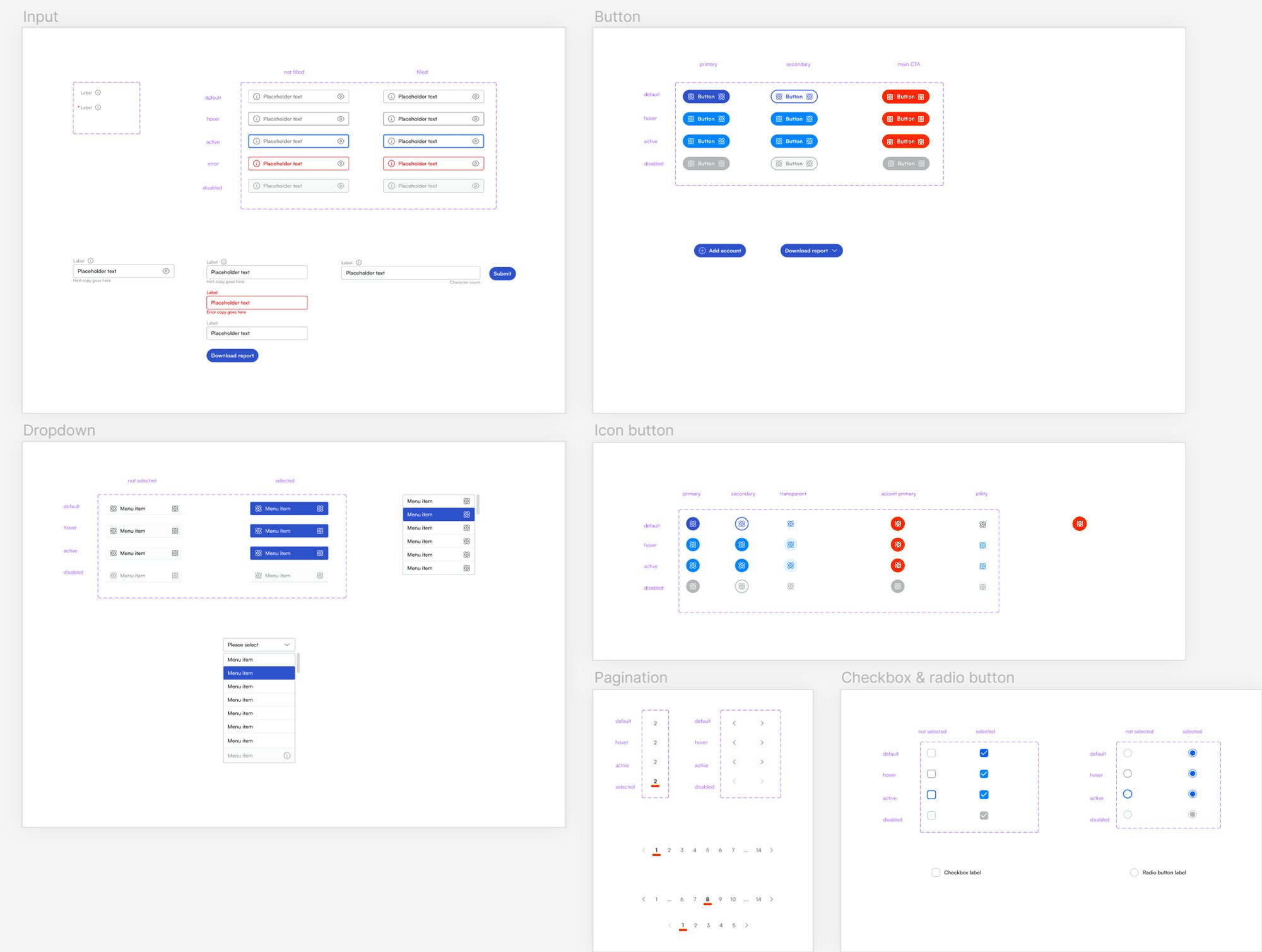
Design ideas and high-fidelity prototypes
…High-Fidelity Prototypes: Finalize design details in high-fidelity mockups.
Development: Build the site with close collaboration between designers and developers.
Quality Assurance: Conduct extensive testing.
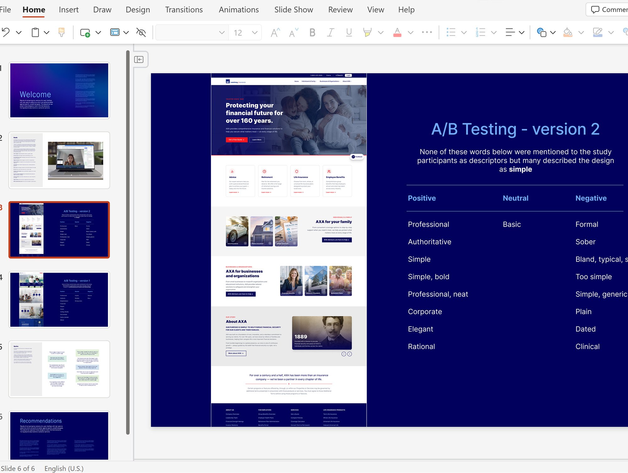
We used A/B testing to evaluate how different layouts influence users' behavior.
We also conducted preference testing where we asked participants to list several words that describe each design. Our goal was to find which option felt more trustworthy and helpful.
Impact
By addressing ... the conversion rate increased by 14%, bounce rate in claim filing process dropped from 82% to 56% which resulted in reducing call volume to Help Center by 7%.